Saturday, 13 July 2013
Tea box and standee part 2
Standee
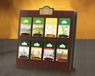
To keep with the concept of the tea
box, I’ve decided to make design my standee like a wooden shelf. So it looks
like you are at home. Not only that, the wooden shelf gives the illusion that
of teacups on shelves as the design of the tea box is a tea cup. It is simple
yet very attractive and it makes my tea boxes stand out. I didn’t want my
standee to overpower my tea boxes. On top of the shelf is a enlarge version of
the logo of the tea boxes which is the teacup. This not only informs people of
what product and brand it is, but it also gives the illusion that the teacup is
on top of a wooden shelf. I want everything to look cohesive and invoke the
experience of drinking tea.
Target audience:
The primary target audience are
young adults aged 20-40. They are the majority that drinks tea. They are also
the age group that will find the concept and the design for the tea box
attractive.
Tea box:
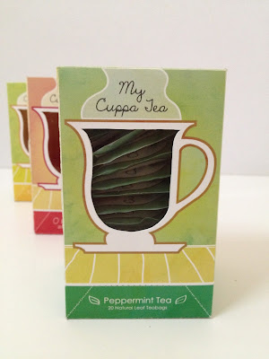
The name of the brand is ‘My Cuppa
Tea’ and the slogan for the brand is ‘Just the way you like it’. It is a play
on the phrase ‘my cup of tea’. It makes the brand seem relaxed and
approachable. There are 3 different flavors which are peppermint, lemon and
raspberry tea. The colors of the box reflects the flavors of the teas. There
are 2 opening to the box. The tea can be taken out from the cut out flap at the
bottom or it can be taken out from the opening on the left side of the box
where there is an open marker.
There is a window cut into the
teacup. This is so that, as the tea is shown in the window. It looks like tea
slowly decreasing in a teacup. The window also serves another purpose as it
indicate the level of tea. As the tea decrease, the panel at the back will
reflect what level it is. There are 4 levels which are drink me, keep drinking,
halfway mark and refill time. This panel starts from yellow and it turns to red
as the level indicates ‘refill time’.
The ingredients and information of
the tea are displayed on the side and back panel of the box.
Tea Box and Standee
Project 2
Tea packaging and standee
The brief:
For the second
project we were given a choice to create either a packaging for cereal, tea,
biscuit or coffee. I have chosen to design a packaging for tea as not only do I
like drinking tea but I’m also very inspired by tea boxes. To go along with the
packaging, we are also required to create a scale down standee to place the
packaging.
Concept:
Tea box
The concept for
the tea box is a homely and cozy feeling. This is the experience you get when
drinking tea. I wanted to make the design simplistic yet still looks attractive
and different. I think a simple teacup can illustrate all this. The shape of
the teacup is a universal symbol for tea. When people see the teacup, the
immediately think of how they feel when they are drinking tea. The colors of the boxes add to the feel of
the concept to invoke that warm and cozy sensation and amplify the person’s
memory of the experience of drinking tea. I designed sketchy lines to make the
box look rustic.
Standee
To keep with the concept of the tea
box, I’ve decided to make design my standee like a wooden shelf. So it looks
like you are at home. Not only that, the wooden shelf gives the illusion that
of teacups on shelves as the design of the tea box is a tea cup. It is simple
yet very attractive and it makes my tea boxes stand out. I didn’t want my
standee to overpower my tea boxes. On top of the shelf is a enlarge version of
the logo of the tea boxes which is the teacup. This not only informs people of
what product and brand it is, but it also gives the illusion that the teacup is
on top of a wooden shelf. I want everything to look cohesive and invoke the
experience of drinking tea.
Inspirations:
Moon cake packaging
Project 1
Mooncake packaging
The Brief:
The brief for
the first project is to create a mooncake packaging. The mooncake packaging has
to possess aesthetic values that reflects the mooncake festival/ tradition. Not
only that, but it also has to practical where it is easy to store.
Target audience:
Families
Concept:
The concept for
my box is a Chinese pagoda. A pagoda is a symbolic structure within the Chinese
culture. It is also where the story of gods and goddesses come to life. This is
important as it is also the inspiration for my mooncake packaging. Around the
box, there are illustration of the story of the mooncake.
Inspirations:
Exercise 4
Exercise 4
For this exercise,
we were told to create our own store. The name of the store has to relate to
the product that is being displayed. I have chosen the name ‘Carrieon’ as it is
a play on words from ‘Carry On’. Carry on is used to symbolize luggage. As when
you board the plane, there is an option for ‘carry-on luggage’ that you can
bring into the aircraft. Therefore, the window display and the design of the
store is meant to look like an aircraft. The window display is using a tiffany
style display where the windows are small and only displaying one or two items
compared to usual big window displays.
Exercise 3
Exercise 3
For this exercise,
we are required to design a window display to show the different ways of
arranging products for a window display. The window display design below
demonstrate a pyramid style of displaying products where the handbags on the
pillars start from the smallest bag and shortest pillar to the biggest bag and
tallest pillar which meets in the middle.
Exercise 2
Exercise 2
This exercise was based on the lecture on different types of window display. Therefore, the objective of this exercise was to design one type of window display. The type of window display that was chosen for this exercise is a window display with an awning. The product chosen to be displayed are candy.
Exercise 1
Exercise 1
For our second exercise, we were
required to design a window display for boxed products. The objective for this
exercise is to play around with the colors and lighting of the window display.
The colors and lighting of the window display is supposed to be cohesive with
the product. The product chosen for the window display design below is perfume.
The colors are chosen based on the theme of spring.
Subscribe to:
Comments (Atom)


